All work

Selected work — Experience design

Designing digital storefronts
for stronger first impressions.

Exploring how businesses can express identity, credibility and personality within the 1881 ecosystem.

01 — Overview

First impressions
happen on a screen.

For many businesses, the first interaction with a potential customer happens online. Before a phone call is made, a message is sent or a purchase is considered, people evaluate trust through what they see on a screen. Images, descriptions, contact details and visual presentation all contribute to that first impression.

This ongoing project explores how design, accessibility and content quality can help businesses present themselves more clearly and effectively in digital environments.
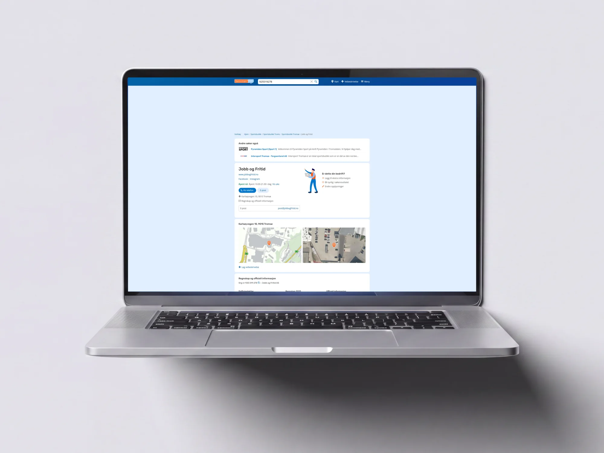
A laptop showing the Jobb og Fritid business profile before the storefront treatment — a plain white card with the company name, links and opening hours on the default pale blue background
Before — the standard profile
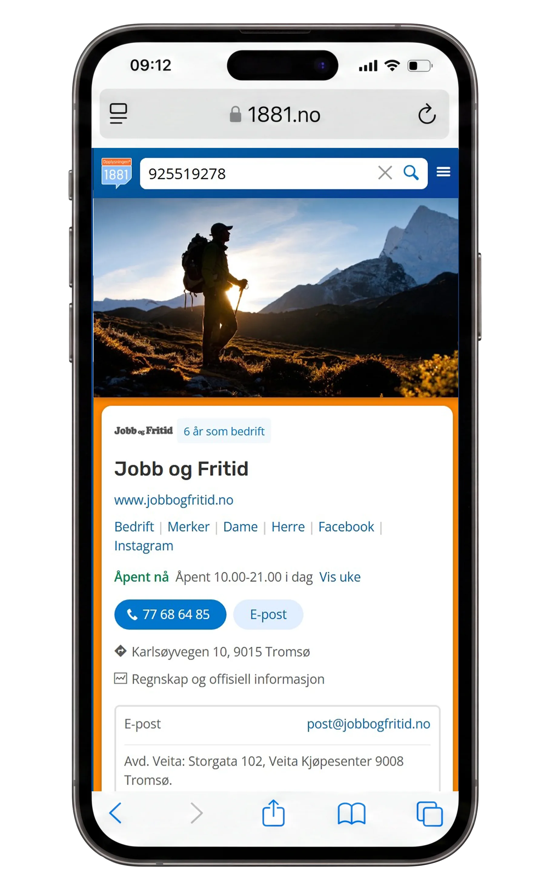
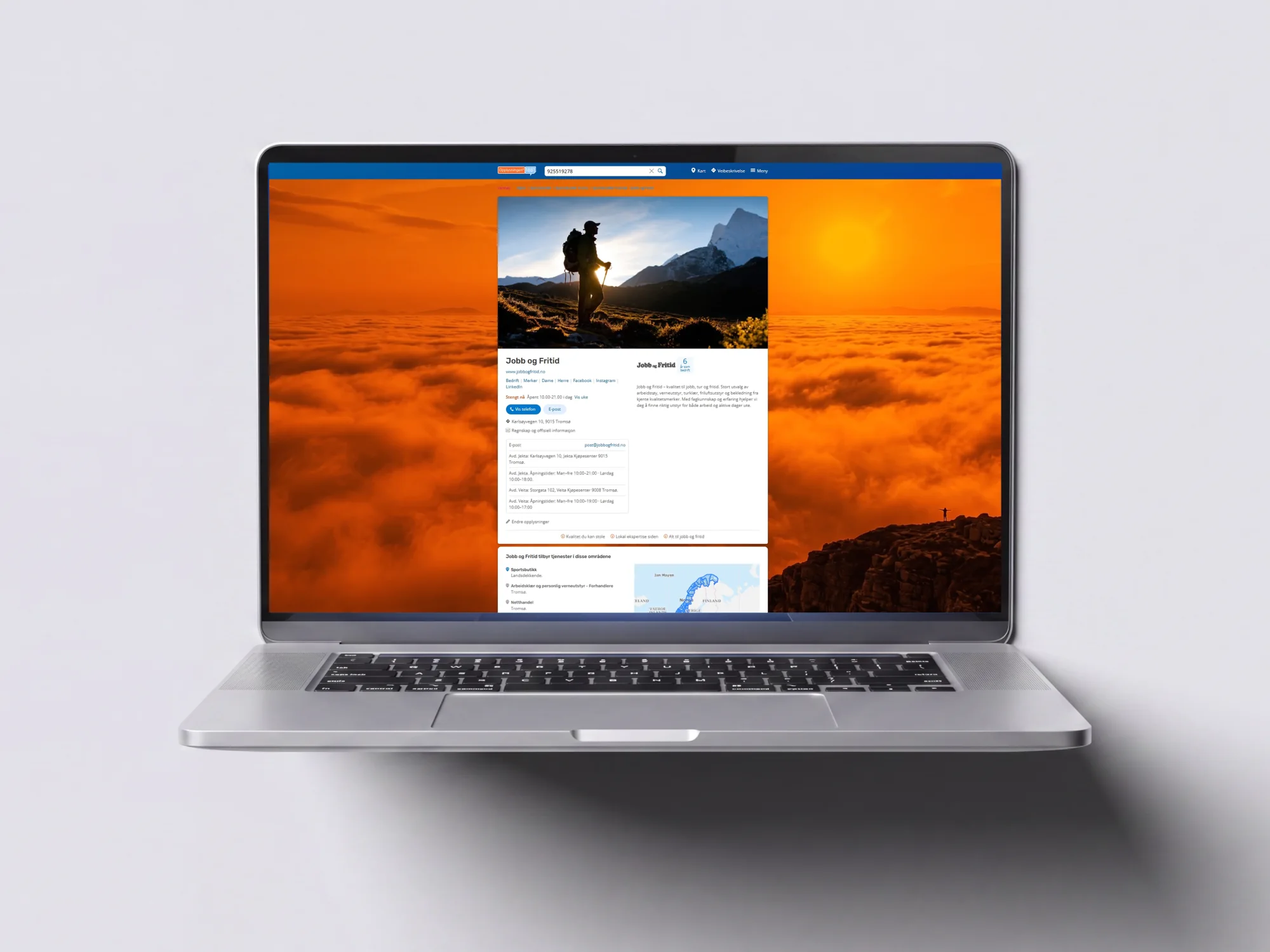
The same profile as a digital storefront — a full-bleed mountain photograph as the backdrop, the company logo, a description and the brand’s orange carried through the page
After — the same business, with a face
Context
In-house Project
Discipline
Experience design
Focus
Digital identity & business presence
Status
Ongoing

02 — The challenge

Businesses come in
all shapes and sizes.

Some have professionally produced branding and photography, while others rely on self-created materials. As a result, the quality of digital business profiles can vary significantly.

Questions I found myself asking were:

  • 01How can businesses stand out while remaining within a shared platform?
  • 02What makes a digital business profile feel trustworthy?
  • 03How can visual identity improve recognition and engagement?
  • 04How can accessibility and consistency support a better experience?

The challenge was not simply visual consistency, but creating better experiences for both businesses and visitors.

03 — The storefront toolkit

Building blocks
for digital identity.

Rather than designing unique experiences for individual businesses, the goal was to explore a scalable set of components that could help thousands of businesses express their identity.

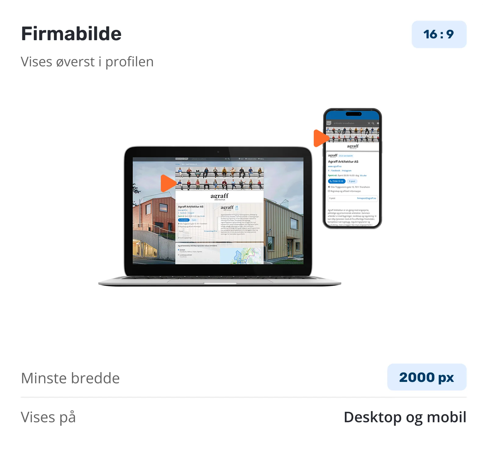
Component card for Firmabilde — a 16:9 company image shown at the top of the profile on desktop and mobile, minimum width 2000 pixels
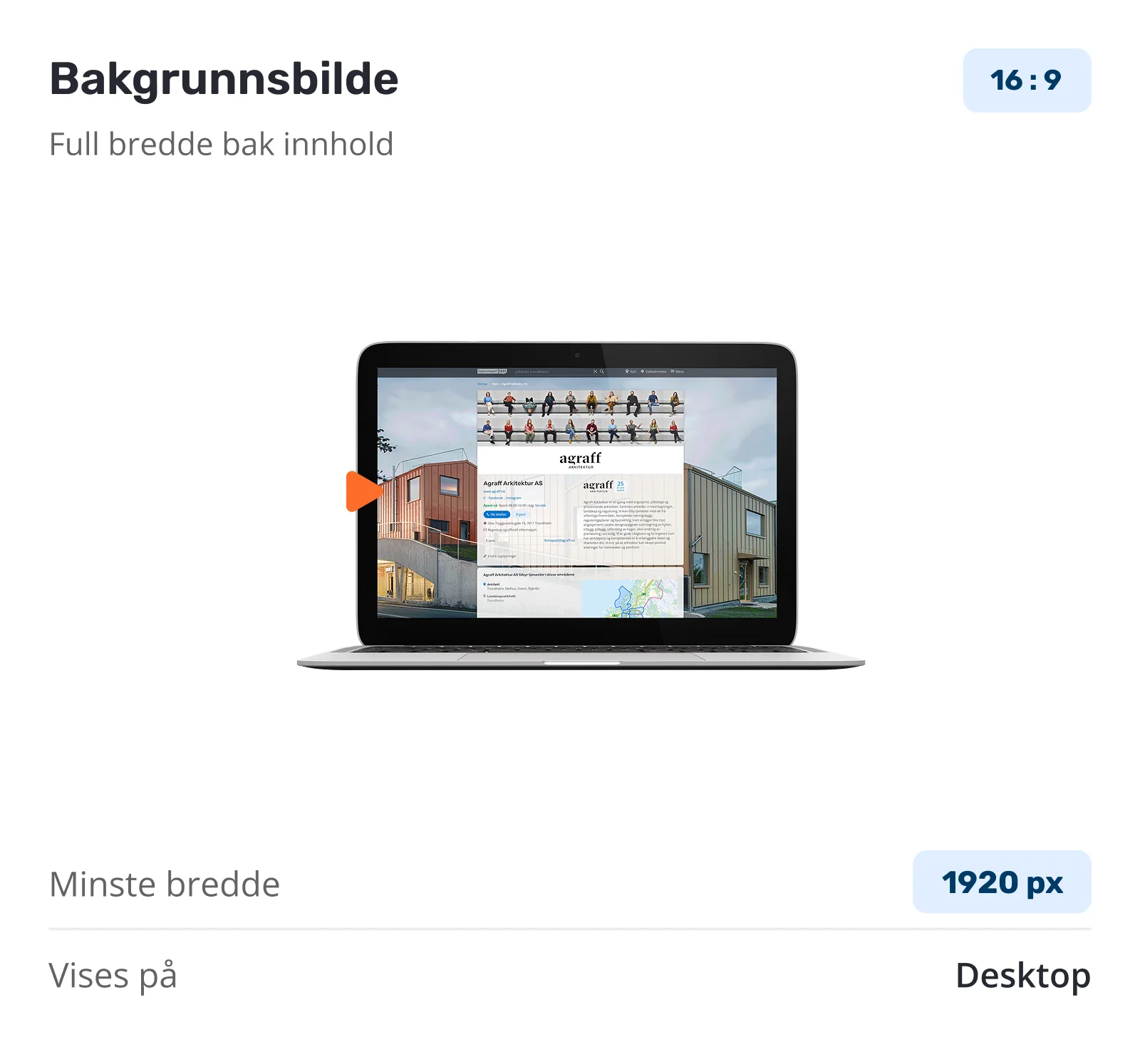
Component card for Bakgrunnsbilde — a 16:9 full-width image behind the content on desktop, minimum width 1920 pixels
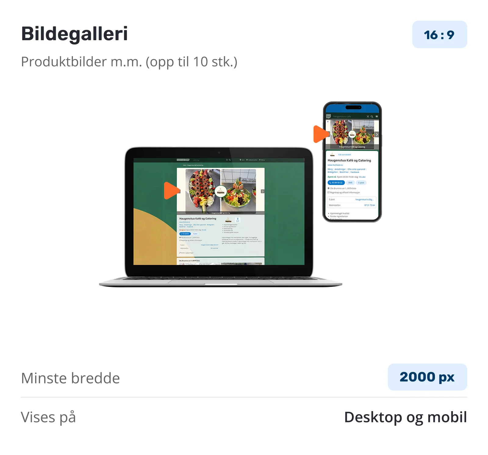
Component card for Bildegalleri — up to ten 16:9 product images shown on desktop and mobile, minimum width 2000 pixels
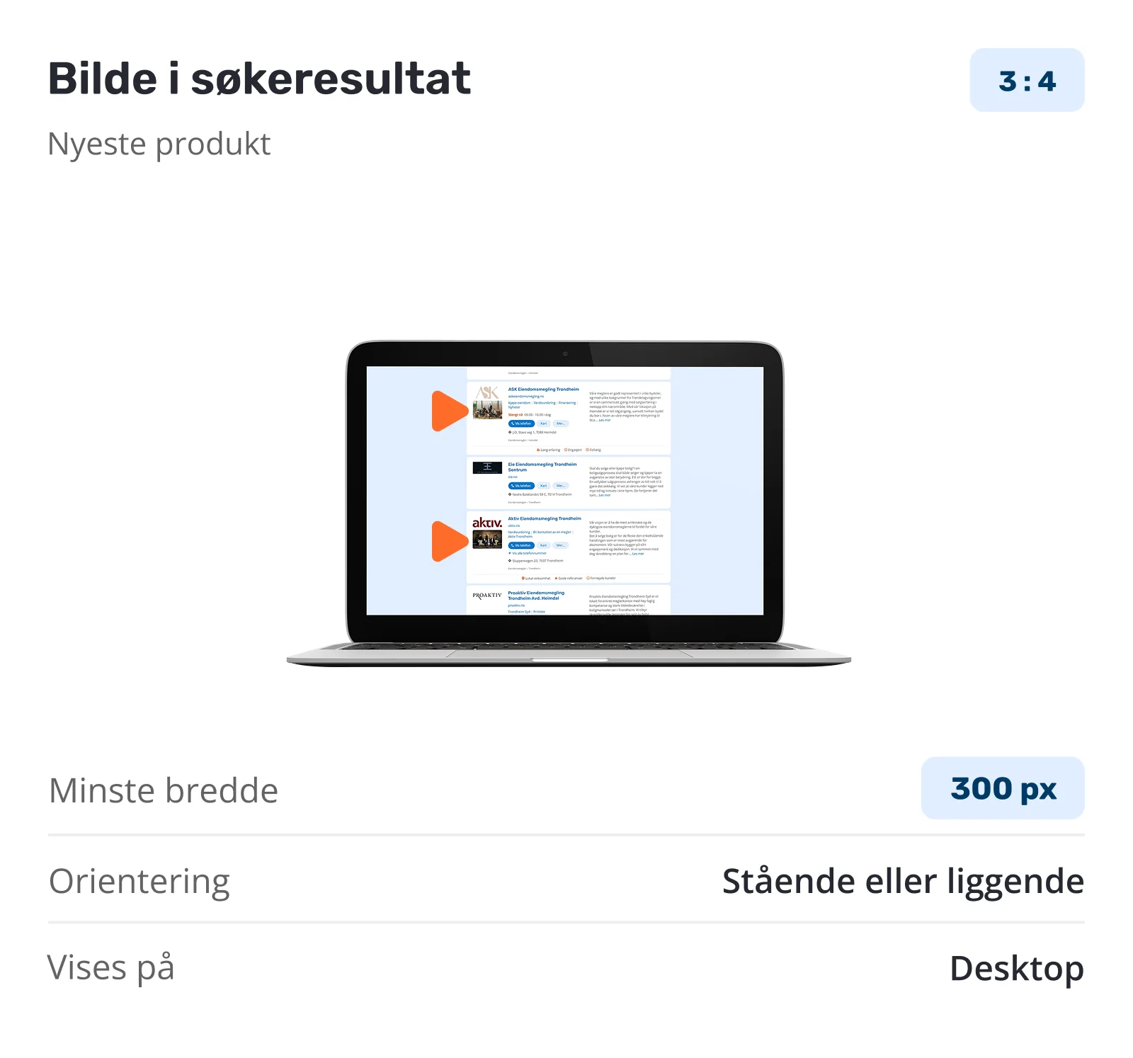
Component card for Bilde i søkeresultat — a 3:4 image beside the listing in search results, portrait or landscape, minimum width 300 pixels

04 — From search to profile

A storefront starts
before a click.

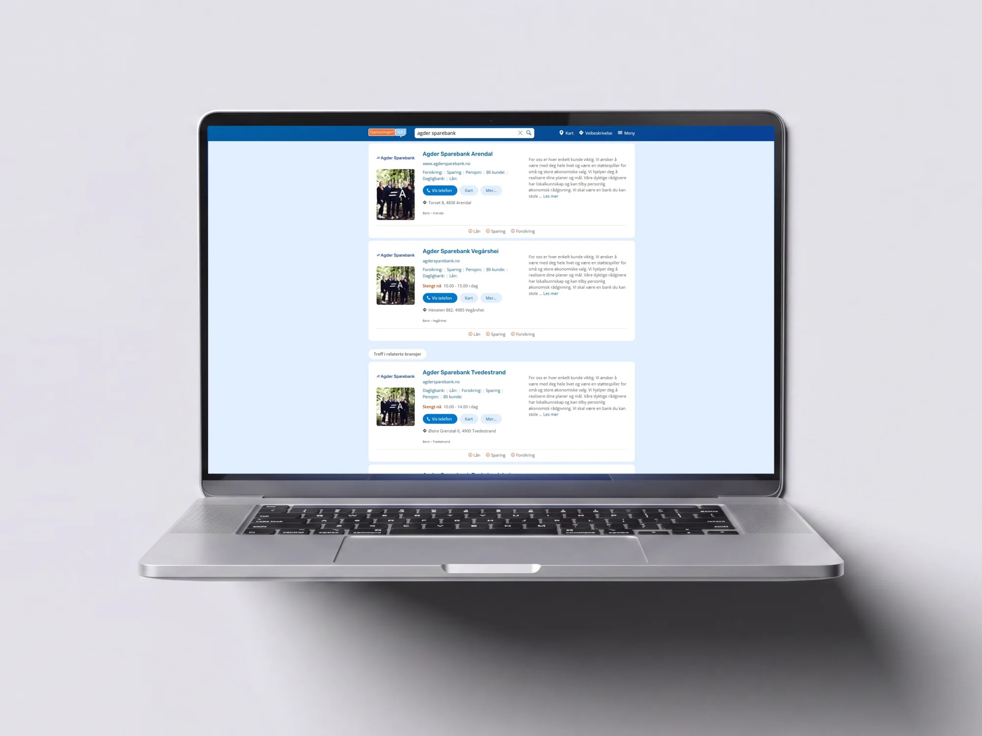
Long before anyone opens a profile, they are scanning a list of results and deciding which name to trust. That list is the first storefront a business ever has.

Extending the identity components into the search result means a business is recognisable at the moment of choice — the logo, the imagery and the tone are already there, rather than waiting one click away.

A laptop showing an 1881 search result page for Agder Sparebank — each branch listed with its logo, a staff photograph, a description and quick actions for phone and map
Identity carried into the result list

05 — One framework, many identities

One framework.
Many identities.

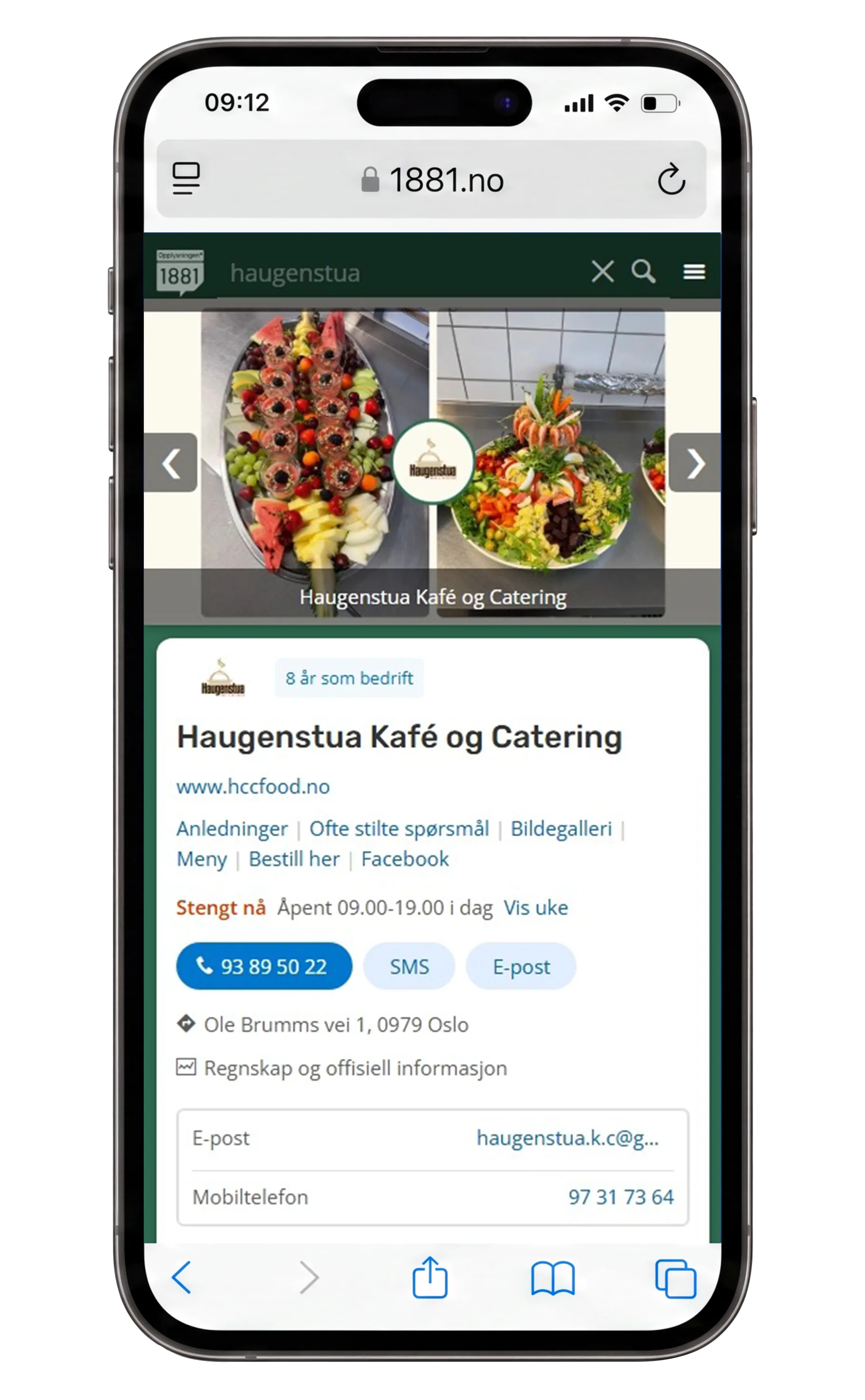
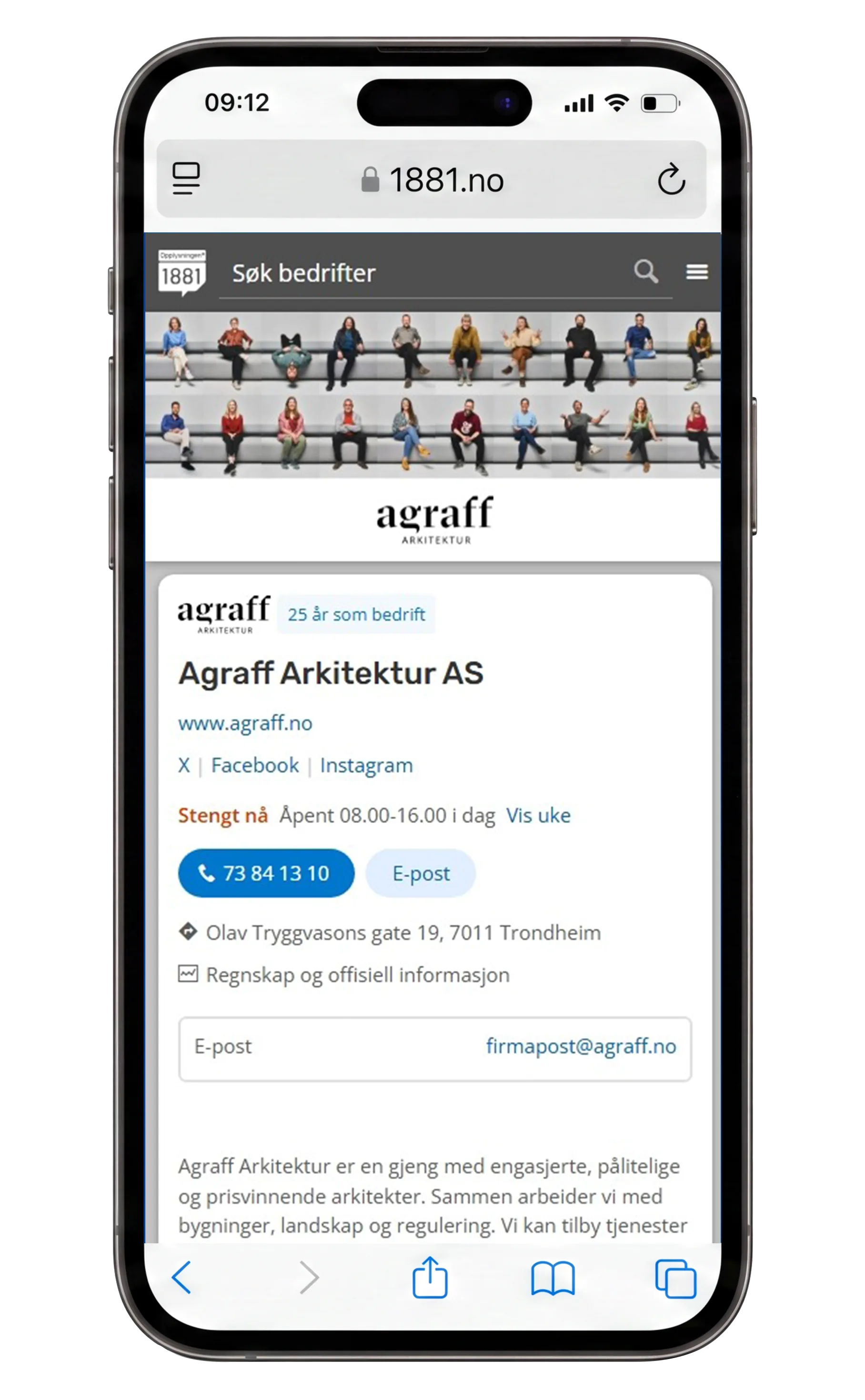
The challenge was not to create unique layouts for each business, but a flexible system capable of supporting a wide variety of industries and visual expressions.

A phone showing a café and catering storefront — a gallery of food photography above the profile, with the business’s deep green carried across the page
Café & catering
A phone showing an architecture practice storefront — a grid of staff portraits above a restrained black-and-white wordmark
Architecture
A phone showing an outdoor retailer storefront — a hiker photographed against a sunlit mountain, with the brand’s orange framing the profile
Outdoor retail
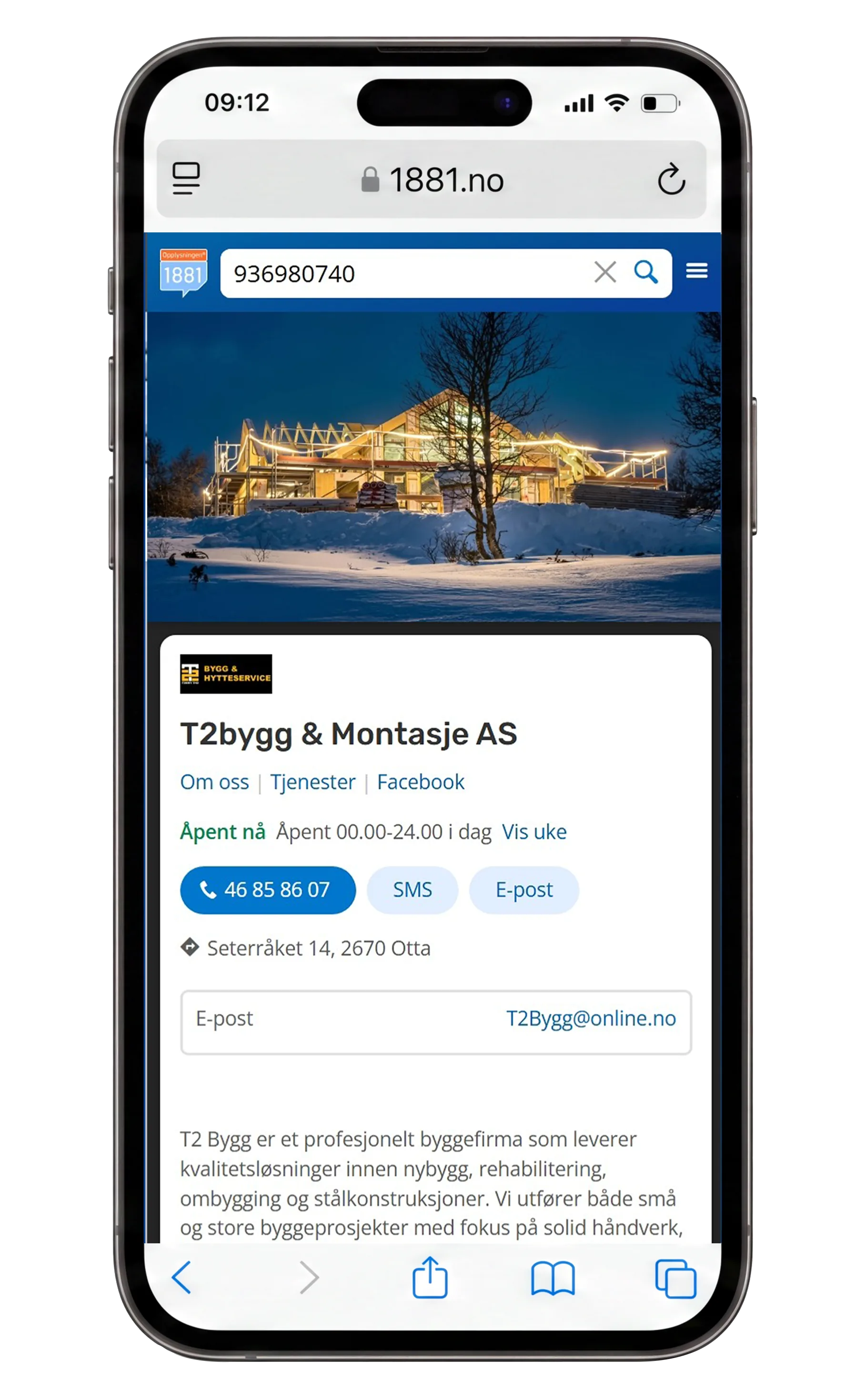
A phone showing a construction firm storefront — a timber frame lit up against snow at dusk, above the company logo and contact actions
Construction

06 — Responsive experience

Designed for
every screen.

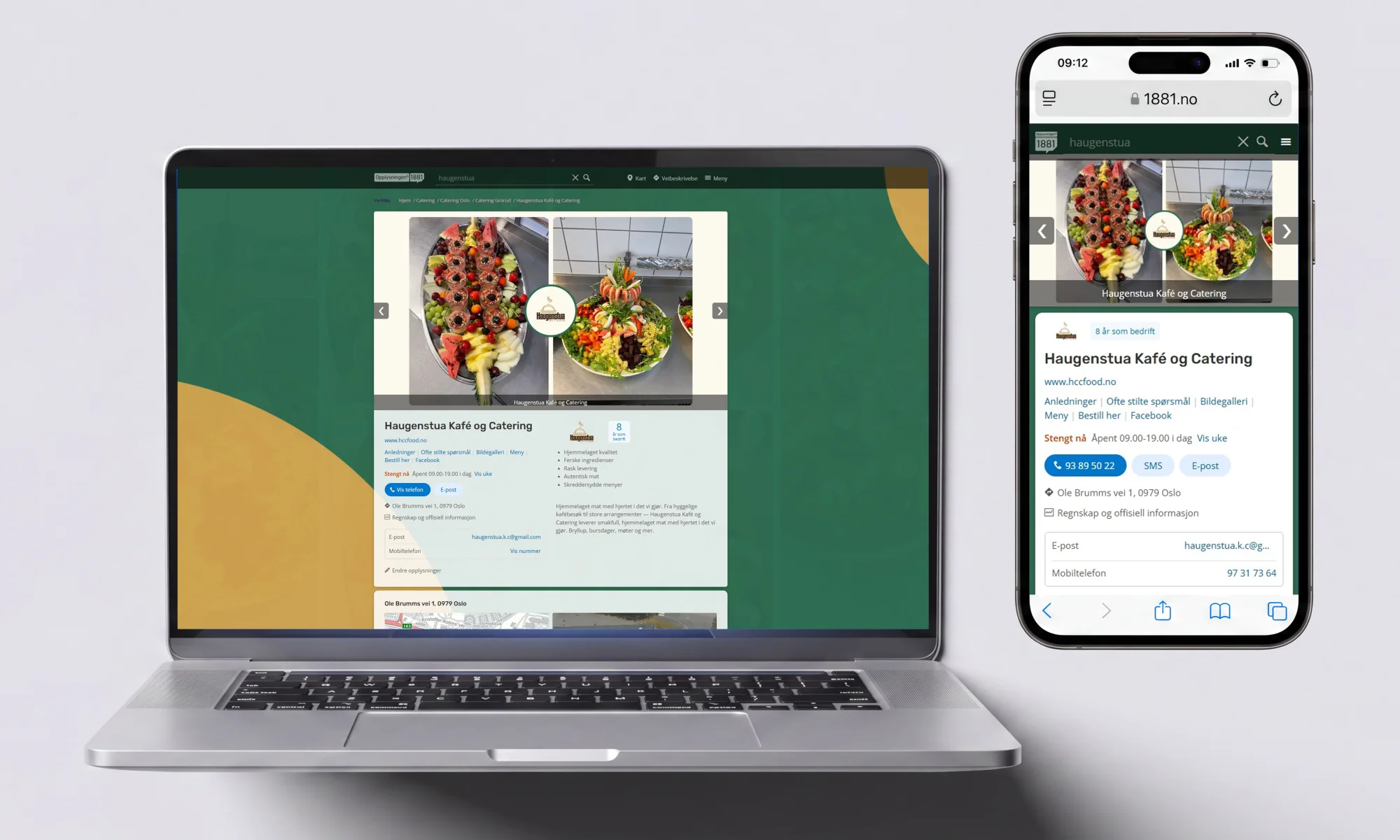
The same components have to hold together on a phone held at arm’s length and on a wide desktop screen. Imagery crops, contact actions stay within reach, and the identity survives the change of shape.

A laptop and a phone side by side, both showing the Haugenstua Kafé og Catering storefront — the same food gallery, logo and deep green identity, re-laid out for each screen
One storefront, two screens

07 — Design principles

Five things the work
continues to hold to.

  • 01

    Clarity

    Users should quickly understand who the business is and what it offers.

  • 02

    Trust

    Good design helps create confidence before direct contact is established.

  • 03

    Accessibility

    Information should be easy to consume regardless of device or user needs.

  • 04

    Simplicity

    Reducing unnecessary complexity improves comprehension.

  • 05

    Consistency

    A familiar structure helps users navigate more efficiently.

08 — Reflection

“People rarely notice good structure when it is there, but they quickly notice when it is missing.”

The project explored how business profiles could evolve from static information pages into recognizable digital storefronts.

By combining structured information with visual identity components, the concept aimed to help businesses communicate not only what they do, but who they are.

The work also highlighted an interesting balance between flexibility and consistency: allowing thousands of businesses to express themselves while maintaining a cohesive platform experience.